📌 Overview
I led the launch of a lightweight MSN homepage experience for Southeast Asian (SEA) users accessing content on low-end devices and slower mobile networks. The goal: improve performance, reduce bounce, and maintain engagement — all while reducing operational load for content editorial teams.
❓ The Problem
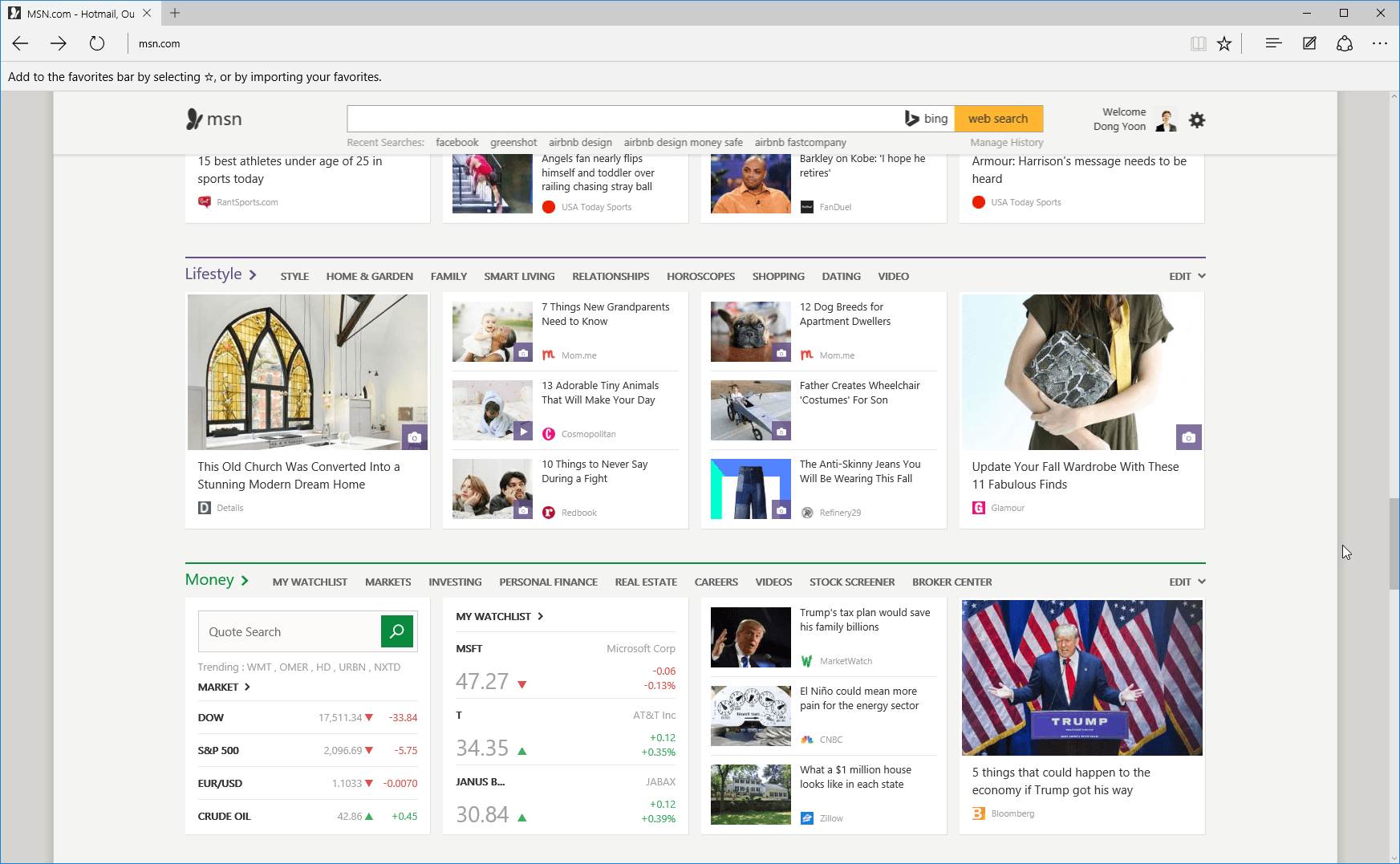
The standard MSN homepage, while rich in content, was too heavy for users in markets like Indonesia and the Philippines. Load times lagged, and bounce rates were high. Additionally, content editors were tasked with updating a large number of content blocks daily, reducing their ability to focus on higher-value editorial work. The hypothesis is by creating a lighter homepage experience, we can improve performance, which lead to better user engagement and operational efficency.
💡 The Solution
We launched an experimental lighter homepage experience that:
- Removed non-essential content blocks (from 20 to 12)
- Minimized number of content images in the content blocks.
- Prioritized key content and breaking news at ATF.
By simplifying layout and content requirements, we not only improved UX but also created a more sustainable content workflow for internal teams.
📈 The Impact
- Page load times dropped by 5~10% across test markets.
- User engagement improved by 4~5% in SEA markets (e.g., Indonesia, Vietnam, Philippines, Singapore, Malaysia)
- Content editors reported improved efficiency, focusing more on:
- Breaking news discovery
- Social media engagement
- Curated, high-impact editorial choices
- Shared the learnings to other region. When tested in Japan and Korea, the lighter version did not improve engagement, highlighting how different content expectations and consumption habits require region-specific approaches
🧠 What I Did
As Product Manager, define the hypothesis, designed and ran the experiment end-to-end, starting with a controlled test in English-Philippines (EN-PH) — one of our key SEA markets. The experiment used a 45/45 % split between treatment and control traffic groups to monitor behavior change and engagement impact.
- Define hypothesis, success/guardrails metrics and owned the experiment scorecard.
- Monitored load times, scroll depth, and content engagement metrics daily.
- Partnered with content, design, and engineering to ensure the variant reflected local content priorities.
- Reviewed results post-experiment and validated against our hypotheses.
- Scaled the successful variant to other SEA markets and Asia markets.
This approach ensured that we didn’t just ship a faster page — we shipped the right experience for the right users.
🔍 Key Learnings
Sometimes less is more — by reducing complexity, we delivered both performance wins for users and efficiency gains for our internal teams. And perhaps more importantly, this experiment underscored the need to design with regional behaviors in mind, not just global best practices.